Well, I have spent a good deal of my time searching for an impressive painting quote to grab your attention. I couldn’t find one that could get mine! And that certainly isn’t something you want someone to say about your home.
Although you can play safe and choose the plain boring colors for your house at any given time, I am going to take you through the journey of choosing the right paint colors. They don’t have to be super bold or whitish whites. The color palette should not only accentuate the features of your house décor but also make you feel at home. And playing with the natural and artificial light sources can make all the difference.
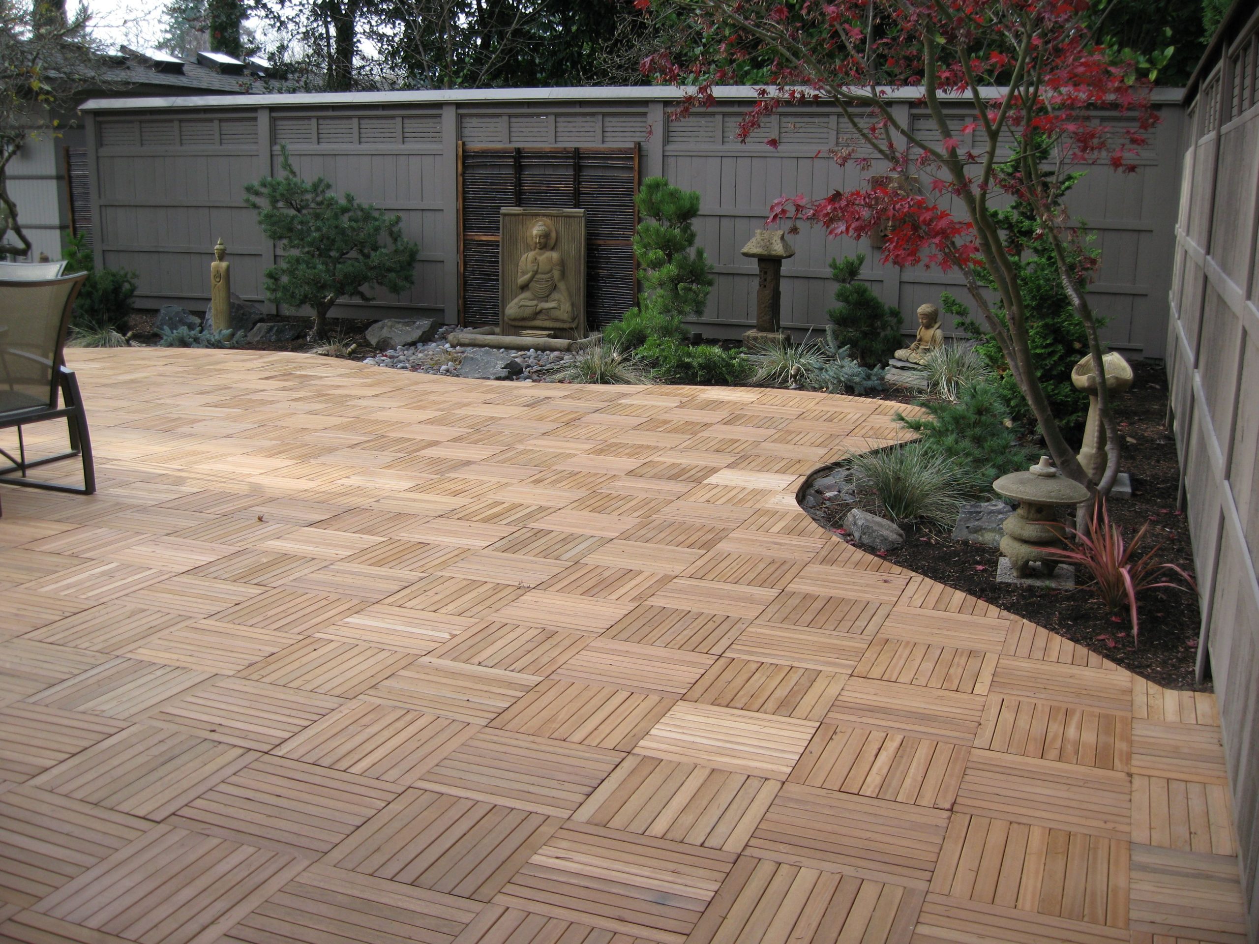
Let’s assume that you have got a house with plain walls. You want it to look ethereal, comfortable, and smart at the same time. Painting happens to be the most time and cost-efficient way to transform it. The painting project is going to take a good amount of planning, some tests, and a lot of spontaneous energy! (And the money obviously).
Whether you are hiring a professional painting service or not, here is the smart way to choose the right paint colors for your house interior.
Table of Contents
Understand How Lighting Affects the Paint Colors
The single most important preparatory step is to understand how lighting affects the paint colors. A lot of homeowners get impressed by a certain paint color in their neighborhood or on a social media post, paint it in their home, and get disappointed. That’s because they didn’t think about the lighting.
For those who don’t know the technical term “illuminant metamerism”, you must have seen that colors take different hues under different lighting. This phenomenon can change the entire look of your house throughout the day as the lighting conditions vary.
Understand that natural light brings out the truest hue of the colors so they will appear differently than they did under the bulb of the painting store.
Based on the directional placement of your house windows (source of natural light), the following are some useful tips to choose a color theme for your house.
- For rooms with north-facing windows, indirect natural light infuses the space with warn and soft tone that remains consistent throughout the day. Light colors appear slightly muted whereas dark colors seem darker. If you want to balance out the infused light, opt for warmer colors.
- For rooms with south-facing windows, more intense natural light can be harsh on sunny afternoons. Darker colors appear brighter and the pale colors look faded. Soft pale tones look fresh and welcoming in such rooms.
- West-facing rooms are darker in the morning and bright in the evenings. Yellow and rich golden tones of the evening light can become overwhelming on sunny days. The best color options are neutral white or cool hues of blue and green.
- To cool down the east-facing light, blue and green are considered reliable colors. It best to avoid dark colors in an east-facing room because they will appear too intense in the bright mornings and drab as the evening progresses.
Decide On the Paint Finish
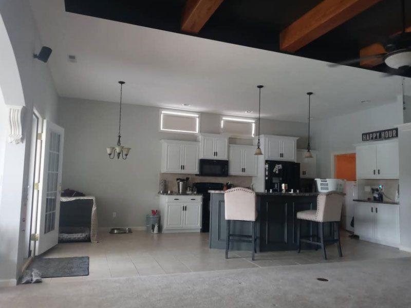
When done right, the color and finish of your paint can accentuate the best assets of your house interior. Using a satin finish, also known as an eggshell finish, works well for almost every wall because it is scrub-able and does not draw attention to imperfections. But it isn’t a cut-and-dried rule. You can opt for flat paints as they offer greater stain resistance and elegance.
The modern painting style is more about creating visual effects with the paint finishes. If you want to achieve a velvet touch for any of your rooms, paint one wall in a satin finish and an adjacent wall in the semi-gloss finish of the same paint color. Moreover, you can make the room look brighter and bigger by painting the ceiling in semi-gloss paints. One simple rule is that the higher the gloss, the more sheen it is. High gloss paint leaves no imperfections hidden.
It’s best to decide on the paint finish after consulting a painting contractor.
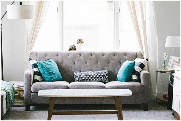
Create A Color Scheme That Matches the Furniture
The best source of inspiration in your home is its furniture. The existing items of furniture or your favorite painting can help you narrow down the color choices. Here is a simple method for creating a color scheme by taking inspiration from an existing object in your home.
- Select any three colors from the prominent objects in the house. Now find three sample strips with those colors and you have got 15 to 18 colors to choose from. Stick to these three sample strips if you can live with the darkest color at the bottom. Pick one color for the walls and two can be used around in the furnishings or fabrics of the room.
- For the adjacent rooms, take the three-color strips and choose one for the theme color of that room.
- Choose a fourth color that can be used as an accent in all the rooms. This creates a connection between the spaces making your home look like a professionally designed home.
Learn Psychology of Colors
While you are at picking the color palette, learn the psychology of colors. They can impact human emotions and can make your home look more appealing and welcoming. Have you ever noticed fast food restaurants are painted red and yellow? The hospitals are always white and light blue for some reason. In general, pick warm colors such as daffodil-yellow, coral, or cranberry for painting social rooms. Whereas home offices, bedrooms, and restrooms look ethereal with sage-green, violet, or sky-blue colors.
Go Dark to Light, Vertically
If you want impressive interior decors that make your home look brighter and wider, go dark to light vertically. According to conventional wisdom, dark floors and white ceilings look well in almost every house design. Recently light-colored floors are getting popular as they reflect lighter and make small spaces look bigger. Pair up the light floors with violets, blues, and cool grays.
How To Preview Before Painting?
After all the considerations, you have chosen the paint color. What’s next to do? Preview. Never skip the preview step because it all comes down to the final and unique look of your home. Following are some tips to do it the right way.
- Paint small swatches in a few places to see whether they look good on the walls. Don’t worry about the mess because they can be easily covered up during painting.
- Get a small square of drywall and paint it with the sample colors. Put it in different parts of the house to see how it looks. View the swatches in varying lighting conditions throughout the day. Preferably, get the preview on a sunny day.
- Some paints slightly change their hue on drying. Paint the swatches the night before to avoid confusion.
- If you like a wall color in most parts of the day but it’s a little off at certain times of the day, you can adjust it with artificial light or curtains!
A Pro Tip!
Hire drywall repair contractors before calling in the painting professionals. Fix the imperfections to get flawless results.